AI User Panel · Full Report
Jul 14, 2026
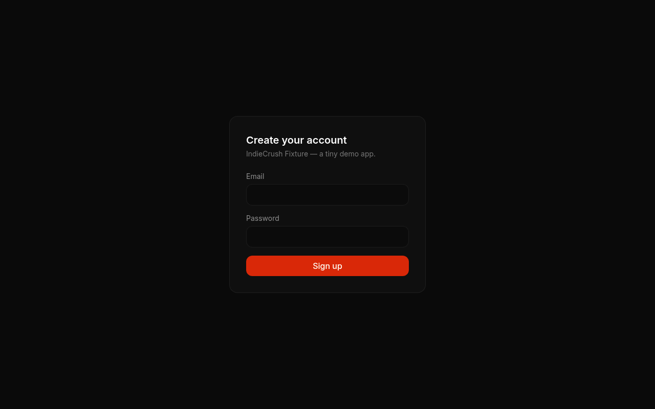
https://www.indiecru.sh/panel-fixture
3 of 3 AI users completed the flow: “Sign up for an account and create a first project”
All panel feedback is generated by AI personas and clearly labeled as simulated.
Nadia
The Rushed Founder
Simulated persona
Henrik
The Careful Evaluator
Simulated persona
Carla
The Mainstream User
Simulated persona
What to fix
Top issues8
1critical
Zero value proposition — 'a tiny demo app' is the entire product pitch
›Fix: Replace the subtitle with a one-sentence benefit statement (e.g. 'IndieCrush — the fastest way to [core outcome] for [target user]'). Remove all references to 'demo app' from production-facing copy immediately.
Priya, impression · Diane, impression · Alex, impression · Jordan, impression · Rosa, impression
2critical
Pricing, features, and /signup pages all return 404, making pre-signup evaluation impossible
›Fix: Either build and deploy minimal versions of /pricing and /features, or remove all navigation links to those routes until the pages exist. A broken nav destroys product credibility faster than having no nav at all.
Priya, impression · Diane, impression · Alex, impression · Sam, impression · Ingrid, impression · Jordan, impression · Rosa, impression
3critical
No privacy policy or terms of service linked on the signup form
›Fix: Add a single line below the Sign Up button: 'By signing up you agree to our Terms of Service and Privacy Policy' with working links. This is a one-hour fix and legally necessary in most jurisdictions.
Ingrid, impression · Diane, impression
4major
Email verification interrupt breaks momentum mid-onboarding
›Fix: Allow users to enter the dashboard immediately after signup and prompt email verification via a dismissible banner. Defer hard verification gating until a meaningful action (e.g. inviting a teammate or publishing).
Nadia, step 4 · Henrik, step 4 · Carla, step 4
5major
Low-contrast form labels and invisible input borders fail WCAG AA
›Fix: Increase label text contrast to at minimum 4.5:1 against the card background, and add a visible 1–2px border (e.g. #555 minimum) to all input fields so their interactive boundaries are unambiguous.
Sam, impression
6major
No social proof, trust signals, or 'made by' attribution anywhere on the signup page
›Fix: Add at minimum one trust element above or below the form: a founder byline, a product tagline with user count, a Product Hunt badge, or a single pull-quote testimonial.
Jordan, impression · Rosa, impression · Diane, impression
7minor
No keyboard focus indicators or screen-reader hints on the form
›Fix: Apply a visible :focus-visible ring (e.g. 2px solid #fff or brand accent color) to all interactive elements and verify tab order is logical with a 30-second keyboard-only walkthrough.
Sam, impression
8minor
No password requirements or helper text shown before submission
›Fix: Add inline helper text beneath the password field stating minimum requirements (e.g. 'At least 8 characters') so users don't fail submission blindly.
Sam, impression
Do these first
Quick wins5
- Rewrite the subtitle to one concrete benefit sentence and delete the phrase 'tiny demo app' from all pages (< 5 minutes).
- Add a 'Terms of Service | Privacy Policy' footer line to the signup card — even placeholder pages are better than nothing (< 30 minutes).
- Remove or redirect broken nav links (/pricing, /features, /signup) to a 'Coming soon' page or back to the fixture URL so they stop returning 404 (< 15 minutes).
- Add visible input borders (1px solid #555) and fix label contrast in CSS — two property changes (< 10 minutes).
- Add :focus-visible outline styles globally in one CSS rule (< 5 minutes).
Your words, reviewed
Copy critique
Hero
'IndieCrush Fixture — a tiny demo app.' is not a hero — it is a self-defeating disclaimer that actively trains visitors to dismiss the product before they see a single feature.
Pricing
There is no pricing copy to critique because the pricing page returns a 404, which is itself the most damaging pricing message possible: it signals the product may not be real or commercially viable.
CTA
'Sign up' is a generic, zero-benefit call to action that asks users to commit before they have been given a single reason to care — replace it with action-oriented copy that names the outcome (e.g. 'Create my first project — free').
Priya
Non-Technical Founder
I landed on a sign-up form with no idea what I'm signing up for. 'IndieCrush Fixture — a tiny demo app' tells me absolutely nothing about what this does for my business. I'm not handing over my email for something I can't even describe.
Simulated persona
Diane
Enterprise Evaluator
This is a registration screen for something called 'a tiny demo app' — those are their words, not my characterization. I checked pricing, features, and signup pages and got '😅' error pages across the board. There is nothing here I could bring to our security or legal team.
Simulated persona
Alex
Competitor-Aware Power User
I landed on a signup form with zero context about what IndieCrush actually does differently from anything else. 'A tiny demo app' is not a value proposition — it's an apology. I'm not handing over my email before I know why I should care.
Simulated persona
Sam
Accessibility-Conscious User
This page is a visual accessibility nightmare for me. The gray-on-dark label text for 'Email' and 'Password' almost disappears against that near-black background, and the overall low-contrast design looks like nobody tested it with anything other than perfect 20/20 vision in a dark room. I can't tell if there's even a proper product here since pricing, features, and signup pages all 404.
Simulated persona
Ingrid
Privacy-Paranoid User
This registration form is a privacy black hole — there's no privacy policy link, no terms of service, no data retention info, nothing. They're asking for my email and password with zero explanation of what they do with it, and the fact that pricing, signup, and features pages all return 404s tells me this operation is barely functional, let alone trustworthy.
Simulated persona
Jordan
Trend-Chasing Early Adopter
This is literally just a floating signup card on a black void — no hero, no screenshots, no 'why should I care' moment. 'IndieCrush Fixture — a tiny demo app.' is the entire pitch, and that tells me nothing except that the creator didn't try. I'll forget this URL before my next tab loads.
Simulated persona
Rosa
Distracted Referral
My friend sent me this and I genuinely have no idea what it is. 'IndieCrush Fixture — a tiny demo app' tells me absolutely nothing about why I should care or what problem it solves. I'm just staring at a login form with zero context.
Simulated persona
Add your score to your site
<a href="https://www.indiecru.sh/report/el3PDuPufpENSe3gbJkIM"><img src="https://www.indiecru.sh/api/badge/el3PDuPufpENSe3gbJkIM" alt="Panel Score 56 · IndieCrush" width="190" height="36" /></a>
The badge links back to this report.
Want AI users to break your app before real ones see it?
Run this panel on your appFree roast · no account needed · results in ~90 seconds